Marvel Comics Reviews for 2-26-2014
Since I’ve read quite a few Marvel comics for the week of 2/26/2014, I decided to encapsulate all their reviews right here in one post. I’ll keep the reviews short and sweet with my “What I Liked”, “What I Didn’t Like” thoughts.
Shall we begin?
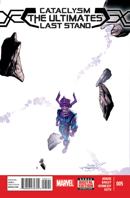
CATACLYSM: THE ULTIMATES LAST STAND #5
Writer: Brian Michael Bendis
Penciler: Mark Bagley
Inker: Andrew Hennessy
Colorist: Jason Keith
Letterer: VC’s Cory Petit
What I Liked: There were a lot of nice character moments between Kitty Pryde and Miles Morales. Could this be the start of a budding relationship between the two? Kitty steps up in a huge way during the final fight with Galactus. Will be interesting to see what the public reaction to mutants will be after this. I am also looking forward to the All-New Ultimate Universe, which is the next phase for the Ultimate brand.
It appeared that Mark Bagley took his time illustrating this issue. His layouts appear more crisp and detailed.
What I Didn’t Like: In the Ultimate Universe, death is supposed to be permanent. However, the deaths that took place during Cataclysm were not clear-cut. No bodies=no death in my book.
Rating: 3 out of 5
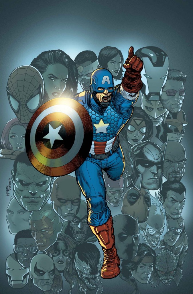
UNCANNY AVENGERS #17
Writer: Rick Remender
Penciler: Steve McNiven
Inker: Jay Leisten
Colorists: Laura Martin with Ponsor, Milla & Molinar
Letterer: VC’s Clayton Cowles
What I Liked: Steve McNiven‘s art really brought a sense of epicness to the “Ragnarok Now” arc. From seeing a Celestial make the Earth look like a gnat under its boot to the large assemble of co-stars like Iron Man, Hulk and Doctor Doom, each page was beautifully put together by McNiven, Jay Leisten, Laura Martin, Ponsor, Milla and Molinar.
I loved the outcome because it was unexpected. For once the good guys don’t win, which will only make for richer stories going forward. Rick Remender is becoming a master of the long form story. He’s mentioned in interviews how this is one-long 25 issue story arc he’s building. It makes me look forward to Uncanny Avengers each and every month. Plus it feels like this is one of the few X-Men books that deals with mutant problems head-on. A lot of X-books deal with more super-heroics and less with mutants as outcasts.
What I Didn’t Like: It was odd to see Doctor Doom working so freely with the other heroes. Part of me wondered was that really supposed to be the Doombot from Avengers A.I. Besides this, there was nothing else for me to dislike.
Rating: 4 out of 5
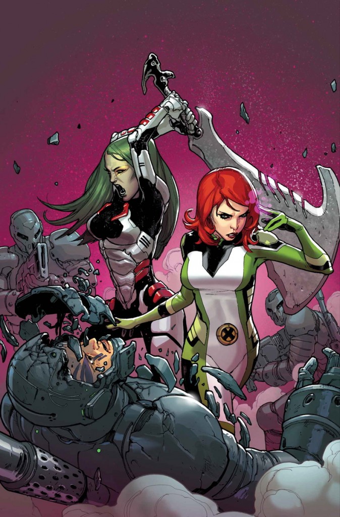
GUARDIANS OF THE GALAXY #12
Writer: Brian Michael Bendis
Pencilers: Sara Pichelli & Stuart Immonen
Inkers: Sara Pichelli & Wade Von Grawbadger
Color Artist: Justin Ponsor
What I Liked: Every issue of Guardians of the Galaxy that has Sara Pichelli providing art has looked phenomenal. It almost has the look of a CGI cartoon brought to life. One of my favorite panels is a group shot of the All-New X-Men, Guardians of the Galaxy, and Starjammers all together looking after Cyclops. Only Brian Michael Bendis could bring together such a mismatch of characters. This doesn’t even take into account the Shi’ar empire.
I’m very thankful to Bendis for bringing back The Starjammers. With a renewed focus on the cosmic side of the Marvel universe, it makes sense to add this brand to the mix. You never know, FOX could decide to introduce The Starjammers in a future X-Men movie.
What I Didn’t Like: While I have been enjoying “The Trial of Jean Grey”, I have to admit that besides parts I and III, not much has really happened. Jean Grey was abducted, and The Starjammers reappeared. The trial hasn’t begun and this story needs to pick up the pace with only two parts remaining. This has been a problem plaguing Guardians of the Galaxy since it launched under Bendis.
Rating: 4 out of 5
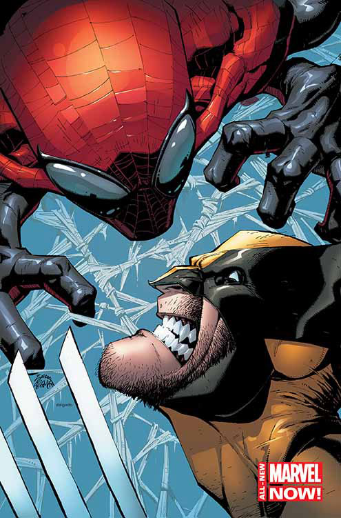
WOLVERINE #2
Writer: Paul Cornell
Pencils: Ryan Stegman
Inks: Mark Morales
Colors: David Curiel
Letters: VC’s Cory Petit
What I Liked: Paul Cornell writes Superior Spider-Man just as well as Dan Slott. Plus Cornell flips the usual dynamic between Wolverine and Spider-Man. Instead of Spider-Man chasing after Wolverine and seeking advice, its the other way around. Spider-Man (with Doctor Octopus in his mind) is confident, while Wolverine is hesitant and in need of reassurances after losing his healing factor.
Ryan Stegman is no stranger to the Superior Spider-Man. Smart choice to have Spider-Man guest-star so early in this new volume of Wolverine since Stegman helped launch Superior Spider-Man. I love the extra definition Stegman gives to character outlines. Shoulders and heads have extra emphasis to them. Small details add so much to the overall artwork.
There is a lot of story potential with The Offer. A crime boss with the power to negotiate the most convenient offer holds lots of influence. He’s competing with Sabretooth to see who can build the largest cartel.
What I Didn’t Like: The back-and-forth between Wolverine and Spider-Man didn’t feel natural. Spider-Man was doing a lot of exposition to keep the story moving. Basically reading Spider-Man’s mind and telling him (and the reader) what was really taking place.
Another small thing that took place was Storm sending a note (through the wind) to a friend regarding Wolverine. I know this is comic books and doesn’t follow the rules of natural physics, but just how could she sense just where this person was, so the note would make it there?
Rating: 3 out of 5
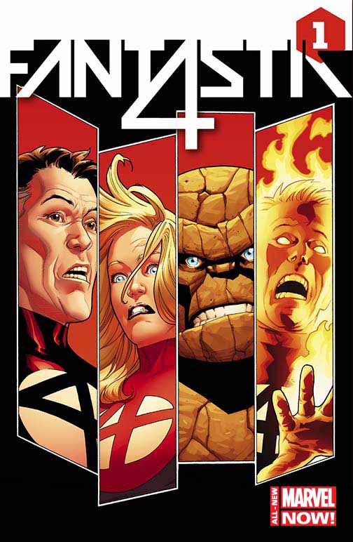
FANTASTIC FOUR #1
Writer: James Robinson
Penciler: Leonard Kirk
Inker: Karl Kesel
Colors: Jesus Aburtov
Letterer: VC’s Clayton Cowles
What I Liked: I’ve never been the biggest Fantastic Four fan, but James Robinson and Leonard Kirk are able to make a first-issue that is new reader friendly, while also setting the stage for the future. The current plan for Marvel writers are to deconstruct the heroes. Take away what makes them who they are so they can pick themselves up by their boot straps. That makes the climb more enjoyable in the end.
Kirk is fitting for a sci-fi adventure book like Fantastic Four. He really captures their looks, and I am a fan of their new uniforms. The red looks good on them.
I also enjoyed Sue Richard’s dialogue in the beginning. Great use of foreshadowing by Robinson. Also glad to see members of the Future Foundation still playing a role in the book.
What I Didn’t Like: While I found the issue enjoyable, it will take a lot for me to keep coming back each month. The Fantastic Four are a concept that is hard for me to keep on my reading list. As far as this issue one goes, there wasn’t anything offensive or off-putting. You had action and the family dynamic all on display.
Rating: 3 out of 5
This review is written in partnership with Pop Culture Network. They can be found at their website http://www.popculturenetwork.com/
Timdogg
#ComicBookChronicles @CBChron founder. Editor-in-Chief of @thekliqnation. Comic book reviewer, podcaster #RABBLERABBLE


-
Shaun Martineau
-
Timdogg
-
StreetzTalk
-
Timdogg
-
-